
 85239 85239 |
 35211 35211 |
|
|
||
|
|
|||||||
| Welcome to the Exploding Garrmondo Weiner Interactive Swiss Army Penis. |
|
GFF is a community of gaming and music enthusiasts. We have a team of dedicated moderators, constant member-organized activities, and plenty of custom features, including our unique journal system. If this is your first visit, be sure to check out the FAQ or our GFWiki. You will have to register before you can post. Membership is completely free (and gets rid of the pesky advertisement unit underneath this message).
|
 |
|
|
Thread Tools |
Member 90 Level 33.52 Mar 2006 
|
No, it had something to do with posts-per-day and post count for HP and threads-per-day and thread count for MP, I believe.
If anything, we can also argue that it might have encouraged spamming by some in order to boost these useless numbers. This thing is sticky, and I don't like it. I don't appreciate it.  |
Member 759 Level 32.36 Mar 2006
|
Do any of the members of administration have anything to say about this? I am a dolphin, do you want me on your body? |
Member 649 Level 24.90 Mar 2006
|
Another thing, the userclass banner can be a quick link to the chocopie Most amazing jew boots |
|
Good Chocobo
Member 8812 Level 17.17 Jun 2006
|
And also, if the mods were doing there jobs, and the members did their part... then I don't see a problem, besides a far more active forum, which I think we could definitely use. What kind of toxic man-thing is happening now? |
I think it would be cool if we could have small emoticon sized images for this. I'd say there is room for 5 of them if you put them to the left of the flag. You could even have an option to limit the amount of them there. So let's say the first three are of the first 3 forums a users posts the most in, in order from 1 to 3. The next one could forum a user has been most active in this week. The last one could be the forum the user is currently viewing or if that user is even online or invisible. These would all dynamically change based on data collected from the forums like Chocopie of course. Wouldn't that be neat?
FELIPE NO 
|
 Member 11 Level 61.64 Feb 2006
|
Member 48 Level 16.03 Mar 2006
|
Hmm. I used to have the original formula for this (from vb2), but I can't seem to find it.
Either way, MP is changed by posts per day * :abunchofequations: and I know for a fact that HP is changed by total posts * :abunchofequations:. What, you don't want my bikini-clad body? <a_lurker|laptop> I think your car died too.
|
Decided to try it out with my top 3 forums: Mario's Warp Room, The Sewers, and Moderator Hut
 Hmmm... it's okay. I feel like it's a tad crowded though. I might just need to make better icons though. I dunno. 8-bit graphics seem to look fairly nice as icons though which goes with the gamingforce name deal. Not sure. Most amazing jew boots
|
Member 11 Level 61.64 Feb 2006
|
Member 23 Level 15.40 Mar 2006
|
This can work, just needs some refinement. If you're going to go for the offline/online icon, that offline/online text line can be removed.
Or move the rating down below the icons, or something. I dunno, just needs some thinking or something. I really can't do that right now, it's just not in me to think. How ya doing, buddy?
Hatred on the fact that I lost my old sig, maybe I'll get it back someday. Or not!
|
Member 27 Level 61.14 Mar 2006
|
It's nice, buddy. But it feels too cluttered. Maybe if you completely lost the ratings cubes it would work better, but multiple graphics on the same line just makes it seem like too much. This thing is sticky, and I don't like it. I don't appreciate it.  John Mayer just asked me, personally, through an assistant, to sing backup on his new CD. |
Member 748 Level 53.85 Mar 2006
|
I like the way it is now. Mood might be fun, but why do we need two OTHER icons in there too?
I don't know about 8-bit images, Acer. Even if it's gamingforce, they don't really match the theme Bobo's building here. I am a dolphin, do you want me on your body? |
lol I know they aren't that great, lurker. I'm just making roughs here. ='D
I came up with another idea. Somehow have it generate your top 3 forum icons and display each in the corner for about 5 seconds or something. Less clutter!   How's that? =o I was speaking idiomatically.
|
Member 11 Level 61.64 Feb 2006
|
Member 789 Level 28.86 Mar 2006
|
I still really don't understand why we need this. Do I really want to have flashing shit going on in the corner in my eye while reading?
However, member ratings five bars should always be present, and they should be yellow to indicate your rank. That would look a lot better. What kind of toxic man-thing is happening now? 
Last edited by UltimaIchijouji; Jul 27, 2006 at 11:17 PM.
|
Member 748 Level 53.85 Mar 2006
|
It is less cluttered, but still, I don't know Acer. Might be a little early still before we dick around with Bobo's layout again.
FELIPE NO |
It's just an idea. I mean if you were to put something in that corner. What would you put? Would it be fun just to put a tiny image of your choosing that fits in a 24 x 24 space instead?
What, you don't want my bikini-clad body?
|
Member 11 Level 61.64 Feb 2006
|
I kind of like that last example, Acer. It's nothing too flashy, and it shows a bunch of info.
Jam it back in, in the dark.  |
Member 48 Level 16.03 Mar 2006
|
Going with the styleset, I'd have to say that the icons would be better off enclosed somehow with an image such as
 is. is.That is assuming that they would be implimented at all. This styleset is better off with enclosed/square graphics than it does with those that are oddly-shaped. How ya doing, buddy? <a_lurker|laptop> I think your car died too.
|
Member 5 Level 45.31 Feb 2006
|
This thing is sticky, and I don't like it. I don't appreciate it. |
Well I just thought about it because we did have moods in that space before at one point. I don't think it's as big as display names. It's not needed either. Just an idea.
I am a dolphin, do you want me on your body?
|
Member 11 Level 61.64 Feb 2006
|
Member 759 Level 32.36 Mar 2006
|
Acer, I liked your last example. I appreciate your attempt.
I was speaking idiomatically. |
Member 829 Level 16.35 Mar 2006
|
I like these ideas, really. The HP/MP/XP bars and chocopie images would be neat, but perhaps the former should be optional.
What kind of toxic man-thing is happening now? |
 Member 7 Level 44.22 Feb 2006
|
I'm not a huge fan of the animated one, but that's just because I hate animation.
I think just one picture of your top forum would be pretty neat and wouldn't require massive changes to the postbit or clutter it up much. FELIPE NO |
Member 649 Level 24.90 Mar 2006
|
how about replacing the gray rectangle where the ratings and flag are with a banner representing your top forum. Like this but better:
 What, you don't want my bikini-clad body? |
Member 107 Level 33.47 Mar 2006
|
Maybe if you grayscale the banner itself with the other icons on top it might look a little more pleasing. Something like this: 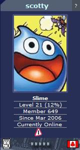 Well you get the idea  . .Jam it back in, in the dark. |
That's not a bad idea, but seems kind of redundant. I'd say have the grayscale banner be the user's top forum and the icon be the forum the user is currently viewing. How's that?
There's nowhere I can't reach.
|
Member 11 Level 61.64 Feb 2006
|
Member 107 Level 33.47 Mar 2006
|
I'll second that. Now we just need better images to represent each forum.
This thing is sticky, and I don't like it. I don't appreciate it. |


 Little Shithead
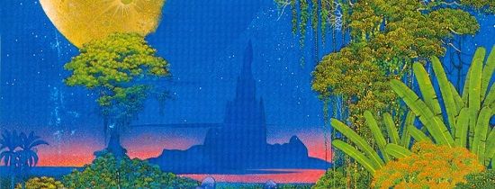
 THIEF
THIEF  scotty
  Vestin
  FatsDomino
  YO PITTSBURGH MIKE HERE
 Bigblah
  RacinReaver