
 85239 85239 |
 35211 35211 |
|
|
||
|
|
|||||||
| Welcome to the Exploding Garrmondo Weiner Interactive Swiss Army Penis. |
|
GFF is a community of gaming and music enthusiasts. We have a team of dedicated moderators, constant member-organized activities, and plenty of custom features, including our unique journal system. If this is your first visit, be sure to check out the FAQ or our GFWiki. You will have to register before you can post. Membership is completely free (and gets rid of the pesky advertisement unit underneath this message).
|
 |
|
|
Thread Tools |
Member 1126 Level 27.05 Mar 2006 
|
Sorry about the size, but it's just too cool.
 How ya doing, buddy? |
Member 54 Level 45.72 Mar 2006
|
Here's a few I happen to thoroughly enjoy, and I would of posted ACZ, Seiken Densetsu and ICO but they've already been done.       All of those are fucking awesome. I'll post some more later. This thing is sticky, and I don't like it. I don't appreciate it. |
Member 1276 Level 19.09 Mar 2006
|
 I still remember finally finding a copy of this baby in the insane week following WoW's release. I almost got screwed by not pre-ordering.  Yeah, I can't find a bigger picture, but goddamn this box was golden. The first game I ever pre-ordered. I don't think any game ever has got me as hyped up as Zelda 64 did.  I know it's not out yet, but this packaging is pretty damn spiffy if you ask me. Oblivion will be fucking incredible. I am a dolphin, do you want me on your body? |
Member 1126 Level 27.05 Mar 2006
|
One more classic Street Fighter boxart: SF2 Special Champion Edition for Genesis.
I like how M. Bison Scissor Kicks Guile just as the Sonic Boom is about to come out. 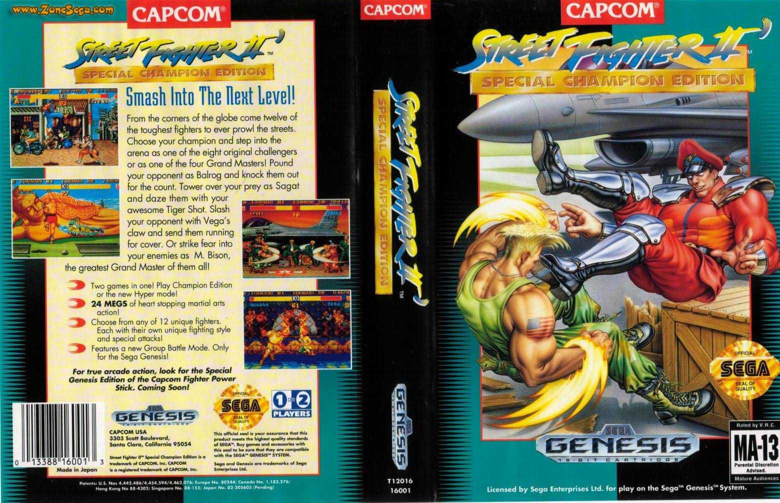 I was speaking idiomatically. |
Member 811 Level 20.71 Mar 2006
|
Awesome game, shitty cover. Konami sometimes has a bad habit of doing this (using the Japanese cover as the intruction booklet cover, and making some really shitty layout for the US one, they recently did that with "Suikoden Tactics"). Thankfully, after this one, all the Suikoden covers have been great, except "Suikoden Tactics".
Suikoden  Suikoden Tactics  Most amazing jew boots |
Member 86 Level 24.92 Mar 2006
|
The NA cover for BLACK is pretty damn good...
 Japanese MGS3 Subsistence packaging:  Closer look at the artwork:  US "Regular" edition packaging:  The "Limited Edition" is the same cover only in red which makes it look like crap. Finally...  FELIPE NO  |
Member 65 Level 32.03 Mar 2006
|
One of the best. So simple, but so good.
 Others I like:   So can I get an Ecco for 360 please.  Also I really like the Condemned one.  What, you don't want my bikini-clad body?
Last edited by Grundlefield Earth; Mar 6, 2006 at 03:09 AM.
|
Member 54 Level 45.72 Mar 2006
|
Jam it back in, in the dark. |
 Member 16 Level 47.67 Feb 2006
|
Besides the game not actually having anything to do with "Suikoden", that is. It's really this game:
 Which actually doesn't seem that good a cover either I personally really like the Children of Mana cover. Not only is the artist terrific, but the picture is so vibrant and well set, it easily brings out the "look" of the game. I hope they use the same cover for the European release, it'd be such a waste otherwise. I'm really fond of old Zelda game covers. The NES ones really simple yet effective, just like Link to the Past and Link's Awakening. Ocarina of Time also continued the tradition (the golden one looks nice, but I actually prefer the regular black/gold version I have. Wind Waker was so different visually I guess the GC cover was fitting. The old covers held that certain graceful majesty to them, much like the PAL Final Fantasy covers with only the original logo (though many non-Europeans seem to prefer the character-filled US covers instead)    The non-platinum FF9 game discs were nice too, featuring the original character drawings by Amano.  Each disc with different color, different characters. How ya doing, buddy?  |
Member 811 Level 20.71 Mar 2006
|
Most amazing jew boots |
Member 50 Level 21.86 Mar 2006
|
Kyril looking awful doesn't help either. I don't really like the Japanese/European one either for some reason, probably because the logo looks pretty awful. I really loved IV's cover though.
I don't get why Americans don't get the simple stylish covers for FF games, I preferred the simplicity of just the logo a lot more over Cloud staring at the Shinra building, or the main cast from FF IX. And I have to agree with Q, the disc artwork for FF IX is just gorgeous. Most amazing jew boots |
Member 617 Level 43.41 Mar 2006
|
I was speaking idiomatically.  - What we all do best - |
Member 1023 Level 27.04 Mar 2006
|
 I think the quirky style fits the game perfectly. Sadly, I can't see many buying a game looking like that. Also, the japanese cart for Hitler no Fukkatsu: Top Secret (Or Bionic Commando if you are boring) is brilliant! Honestly, it has Hitler and everything: 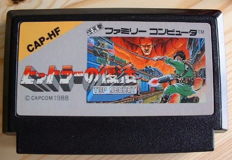 Pac-Man is pure LOL: 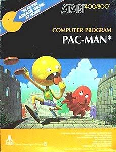 What kind of toxic man-thing is happening now?  |
Member 50 Level 21.86 Mar 2006
|
I personally am not too keen on the FF XII cover, the judge just looks way too big. I like that they are again using the same colour scheme as FFX and X-2, if I'm not mistaken.
FELIPE NO |
Member 158 Level 11.05 Mar 2006
|
 Simply awesome. Looks like the two are contending Rosa. it really gives it an attractively sensual feel. Also this:  Very beautiful, it adequately mirrors the overall mood of the title - even in its quite simple rendition. Most amazing jew boots 
Last edited by Ryunam; Mar 6, 2006 at 10:34 AM.
|
Member 1126 Level 27.05 Mar 2006
|
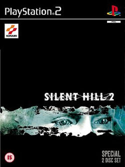
Here's Silent Hill 2, a game I really love: 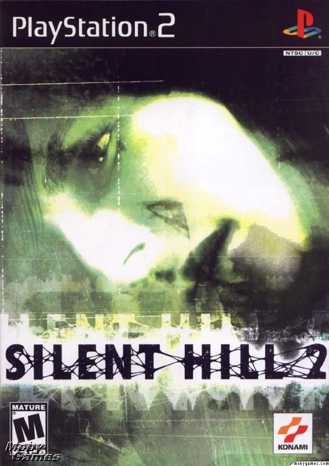 Jam it back in, in the dark. |
Member 811 Level 20.71 Mar 2006
|
While on the subject of Silent Hill, I really hate the Silent Hill 4 US cover, the PAL cover isn't all that great either, but it's definately better than the US cover, the Japanese cover wins in this case.
Silent Hill 4 (NTSC/J)  Silent Hill 4 (NTSC/UC)  Silent Hill 4 (PAL)  There's nowhere I can't reach. |
Member 1172 Level 5.51 Mar 2006
|
 I also like Wipeout 2097's cover. It's probably the only PS1 game I can remember that never had the PLAYSTATION banner along the bottom.  This thing is sticky, and I don't like it. I don't appreciate it.
Last edited by aesop; Mar 6, 2006 at 04:09 PM.
Reason: edit a link
|
Member 1126 Level 27.05 Mar 2006
|
aesop, it seems that the site you got the Wipeout image doesn't allow direct linking.
I've never seen the PAL version of Silent Hill 2. It's cool. Here's the Japanese one: 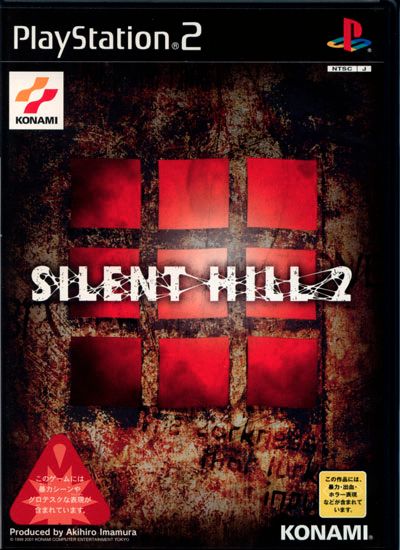 I am a dolphin, do you want me on your body?
Last edited by Timberwolf; Mar 6, 2006 at 02:34 PM.
|
Member 1216 Level 44.27 Mar 2006
|
  They are different I was speaking idiomatically.  |
Member 1216 Level 44.27 Mar 2006
|
Which is odd, because not only are the games have nothing in common with each other (beside the fact that they are shootemups), but the cover has even less to do with the games.
FELIPE NO |
Member 16 Level 47.67 Feb 2006
|
I want this job, I seriously want this job so much. Do these people win these employments in the lottery or what? I mean look at these!   It's like no one's actually checking what they put on the covers. Or maybe they think shock advertisement works with the finished product as well =/
The thick cardboard slipcase held another case inside which opened up, like a fancy "collector's edition" DVD case. The bonus DVD with documentaries was nice too, though it was removed from the Platinum release.  Most amazing jew boots |
Member 50 Level 21.86 Mar 2006
|
Acacia, the second BoF pic is the official European box art, and it looks ten times better than the US cover. The fan art, or whatever it is, is pretty cool, but it's a bit too crowded to look good as box art. I'd love it as a poster though.
Also, the US boxart for SMT: Nocturne looks much better than the European one (also because of the lousy name change). I'll post it later. Jam it back in, in the dark. |
Member 1172 Level 5.51 Mar 2006
|
Qwarky, the Silent Hill2 package came with a collector's card too right, or maybe a sticker? There's nowhere I can't reach. |
|
|
 Similar Threads
|
||||
| Thread | Thread Starter | Forum | Replies | Last Post |
| [PS2] Prinny Dood has invaded this thread; I searched up and probably it wasn't made before | Spatula | Video Gaming | 25 | Feb 25, 2007 05:07 PM |


 Timberwolf
 Elixir
 JasonTerminator
 map car man words telling me to do things
  Peter
Peter  Kilroy
  Ryunam
  aesop
aesop 