
 85239 85239 |
 35211 35211 |
|
|
||
|
|
|||||||
| Welcome to the Exploding Garrmondo Weiner Interactive Swiss Army Penis. |
|
GFF is a community of gaming and music enthusiasts. We have a team of dedicated moderators, constant member-organized activities, and plenty of custom features, including our unique journal system. If this is your first visit, be sure to check out the FAQ or our GFWiki. You will have to register before you can post. Membership is completely free (and gets rid of the pesky advertisement unit underneath this message).
|
 |
|
|
Thread Tools |
Member 5740 Level 1.21 Apr 2006 
|
Hi guys,
It's probably been a year since I last visited - I'm glad that the forum is back up and running! Lately I've been getting big time into web design, and I thought I'd bounce my most recent work off of those of you who are web savvy (which is probably all of you.) I've been working on this site off and on for the past several months, and my registration system is almost up and running. If you notice anything that you think I can do to improve it, please let me know - especially anything involving layout and navigation. Well, enough talk, here's the URL: http://www.socwall.com/ It's good to be back! Kirk Jam it back in, in the dark. |
Member 27513 Level 4.03 Mar 2006
|
I was very impressed with the high quality of all the images I looked at, I didn't see a single picture in the image catagories I looked at that I didn't like. However I did find one error:
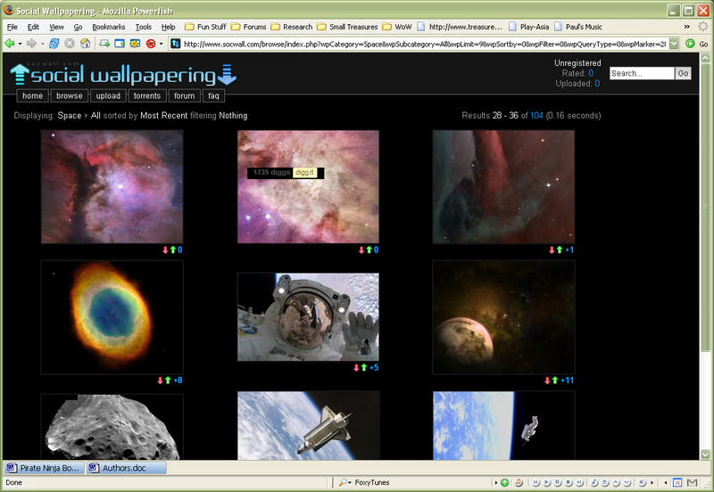 I don't know if it's my browser or what, (since I don't know how to build a webpage or write the coding), but in the top row, middle picture there is something there on every page I looked at. All in all I thought it was a very sleek looking site, easy to navigate, easy to read. Well done! EDIT: It also seems that I'm not able to look at any of the sea life pictures. it just comes up with text that is the same as what's in my URL box. There's nowhere I can't reach.
Last edited by Kara Mano Iru; May 20, 2007 at 05:34 AM.
|
Member 10 Level 40.02 Feb 2006
|
White letters on black background should be reserved for ''hacker'' sites circa 1997.
A bit heavy on the google ads as well. I don't mind people making money from their websites, but when the whole content is literally framed by ads, it gives a first impression that this is some free tripod site. Also, the resolutions of some wallpapers there are kinda wacky. I dunno if it's common nowadays to have a desktop resolution of 3008 by 2000 pixels, but when I click on a wallpaper thumbnail, I don't expect to download a 4 MB file. It's good to have an option for a large resolution, but the default should be some actual reasonable wallpaper size. Though it's an understandable problem if you allow user uploads. It's not a bad idea for a site though, and I did get a new wallpaper for myself. This thing is sticky, and I don't like it. I don't appreciate it. Nothing wrong with not being strong
Nothing says we need to beat what's wrong Nothing manmade remains made long That's a debt we can't back out of
Last edited by Aardark; May 20, 2007 at 05:36 AM.
|
Member 27513 Level 4.03 Mar 2006
|
Huh, I didn't notice any adds, but I have addblock for FireFox... <_<;;
I am a dolphin, do you want me on your body? |
Member 10 Level 40.02 Feb 2006
|
Maybe that's why you didn't notice any.
Most amazing jew boots Nothing wrong with not being strong
Nothing says we need to beat what's wrong Nothing manmade remains made long That's a debt we can't back out of |
Member 512 Level 20.69 Mar 2006
|
Forums and registration are both closed - booo!!!
Honestly, I'm really disapointed with that aspect of the site. There is the soc in the title - for social - or am I mistaken? Otherwise, the site is clean and functional. I was kind of surprised to come across socwall on here - I discovered the site about a week ago and I really enjoyed it. Snagged quite a few wallpapers :3 What kind of toxic man-thing is happening now?
Last edited by neus; May 20, 2007 at 09:22 AM.
|
Member 5740 Level 1.21 Apr 2006
|
Thanks for your good comments and critiques. I just got on Digg and Delicious and had to get a new host to handle the traffic so I went a little overboard on the ad placement.
I'm currently redesigning the site to make it a little user friendly, and easier to navigate the wallpapers. Also, the tagging system will be completely remade. Point taken on the black background - I've really been flirting with the idea of switching to a white BG but the black has grown on me. I'll be bouncing stuff off you guys as I make updates - I take all of your critiques seriously and appreciate them big time. Thanks again! FELIPE NO
Kirk Ouimet
http://www.socwall.com/ |
|
Larry Oji, Super Moderator, Judge, "Dirge for the Follin" Project Director, VG Frequency Creator
Member 22523 Level 1.34 May 2007
|
I like the content of your website, I`m actually using one of the wallpapers I just found.
I agree with Aardark, there are too many google ads and that makes the site look less attractive, maybe remove the ads on the side and keep the ones at the bottom. It would be nice to have different resolutions too, the wallpaper I`m using has a res of 3280x2606 and I`m running windows on a 1280x800 screen making the wallpaper a little bit squashed in. All in all it's a nice little site you have there. Good luck with the modifications. What, you don't want my bikini-clad body?
Last edited by D.Kay; May 21, 2007 at 06:34 AM.
|
Member 27513 Level 4.03 Mar 2006
|
I actually like the black background. I never did much like light, bright backgrounds, they hurt my eyes. If you change it I wouldn't suggest white... or yellow, yellow would be bad too.
Jam it back in, in the dark. |
Member 375 Level 18.41 Mar 2006
|
Nice website you've got there. Clean and simple navigation (reminds me of Deviantart's for some reason), but one thing I'd change as soon as possible is the fact that if I have javascript off all your navigation goes to hell and I can't go anywhere. Create a browse.html file and link it from the Browse menu item. On the browse.html get links to all categories and subcategories.
Also, and as stated above, remove the ads. It makes your site look unproffesional, unattractive and ugly; not to mention they are annoying. I'm currently here: http://www.socwall.com/browse/index....&wpQueryType=1 And I got one big yellow/orange add on top and at the bottom of the page, and one big ugly google ad at my right. Dude, that sucks. It screws your design. Finally, a script to cut images or something (something like this: http://www.marqueetool.net/ ) would be awesome for people who don't want a full 4mb file.  Good job on that site!! Keep it up!! There's nowhere I can't reach.  |
Member 5740 Level 1.21 Apr 2006
|
LOL, thanks for the reply metal. I'm stocked about the Marquee Tool that you linked me to - I've been looking for something like that for a long time!
I've seriously had a mental struggle with my ad spamming - but they are actually bringing in pretty good money - money that I need to pay for the three servers that are keeping the site up. I'm working on a new site design that will place the ads in a much better position and it won't be so "Geocities"-esque. Also, in the next revision of the site I plan on having a Wikipedia style image detail editing option, so the community can edit tags, etc. Thanks for your critique! This thing is sticky, and I don't like it. I don't appreciate it.
Kirk Ouimet
http://www.socwall.com/ |


 Kirk
Kirk  Aardark
  neus
neus  MeTaL_oRgY