
 85239 85239 |
 35211 35211 |
|
|
||
|
|
|||||||
| Welcome to the Exploding Garrmondo Weiner Interactive Swiss Army Penis. |
|
GFF is a community of gaming and music enthusiasts. We have a team of dedicated moderators, constant member-organized activities, and plenty of custom features, including our unique journal system. If this is your first visit, be sure to check out the FAQ or our GFWiki. You will have to register before you can post. Membership is completely free (and gets rid of the pesky advertisement unit underneath this message).
|
 |
|
|
Thread Tools |
 Member 601 Level 52.11 Mar 2006 
|
Box Art Gone Bad
Browsing the shelves at Best Buy tonight, I came across the re-released versions of Clubhouse Games and Hotel Dusk. "Great," I thought, "Now more people will get a chance to play these wonderful games." Then I noticed what horrors Nintendo had wrought upon the box art:
  A MYSTERY NOVEL. Yeah, thanks Nintendo, I never would have figured out what the game was about if you hadn't put a giant orange banner across the top. Why do game companies feel the need to ruin perfectly good covers when they reprint games? We already had Konami's genius picture of a box as box art:  Is there some unwritten rule that reprints must intentionally have bad box art, so the early adopters can feel better about their purchases? Sure, some folks don't care what their game case looks like, as long as they get what's inside, but why purposefully make a product less appealing? And that doesn't even address all the times companies have changed perfectly good box art when releasing games in other territories. Jam it back in, in the dark.  |
Sensors online. Weapons online. All systems nominal.  Member 80 Level 56.91 Mar 2006
|
Well, the Touch Generation stuff makes sense.
People who passed over Hotel Dusk the first time won't really notice it a second time based on the art, so a synopsis of what it's about might help those who will only glance at it and not realize exactly what it is. How effective the new marketing will be, I'm not sure, but I can't imagine it hurting sales in any way. And the more who get to play that one, the better. There's nowhere I can't reach.  |
Member 633 Level 45.75 Mar 2006
|
I don't get what Konami was thinking on that one though.
They made box art of the box art to the game. Great job there. The Cover Project covers a good majority of the covers out there, so buy the game and just print out a new one. This thing is sticky, and I don't like it. I don't appreciate it. |
Member 585 Level 14.23 Mar 2006
|
Holy shit, is that Castlevania box serious? I totally regret buying the game in its original case now, that thing is fantastic!
I am a dolphin, do you want me on your body?
-
|
Member 370 Level 43.75 Mar 2006
|
That's kinda weird about Hotel Dusk, considering it wasn't even part of the Touch Generation series when it first came out.
I really have no problem with different box art for reprints/budget versions of a game, I'd just prefer them to be uniform. I know the Greatest Hits games and the like have their detractors, but I never minded them partly because it's a uniform system, therefore if I was anal about how they looked, at least I could group them with similar looking games. So while at least Nintendo is being somewhat uniform with these (they even switched the placement of the wi-fi logo and TG logo on Clubhouse Games), it's a shame it's only going to work with Nintendo published Touch Generation games. That means Konami is free to keep making crap, and so is any other third-party publisher if they so please. Most amazing jew boots  |
Member 212 Level 29.20 Mar 2006
|
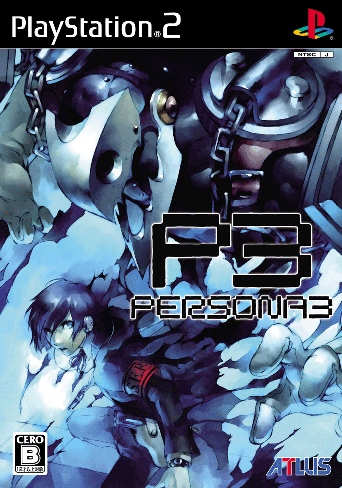
If we're sticking with RECENT games' box art, here's one that comes to mind.
Persona 3 US Box Art Spoiler:
Japan Box Art Spoiler:
Because I got dissed, maybe I wasn't clear in my initial response, US Box Arts always suck. Japanese ones are usually pretty good, stylish as well as to the point. What kind of toxic man-thing is happening now?  
Last edited by Philia; Sep 14, 2008 at 10:26 AM.
|
Member 722 Level 44.20 Mar 2006
|
People, please! CHECK THIS OUT:
"Air Traffic Controller" US Cover: "Air Traffic Chaos"  Japanese Cover:  This falls in line a bit with Nuttyturnips' complaint about Hotel Dusk: Did they feel the need to draw a cartoon character and ALSO have him proclaim his profession? I do have to hand it to them though, the US title change is very accurate. Only a section of airspace filled with CHAOS might include an airplane flying completely horizontally. FELIPE NO 
|
Member 15 Level 45.57 Feb 2006
|
  The PAL PS3 Platinum range is the most God awful example I can think of at the moment.   My eyes! URINE; THE BEST OF PLAYSTATION 3. How ya doing, buddy? |
Member 16 Level 47.67 Feb 2006
|
The later PS2 platinum range design was bad enough, but this PS3 one is absolutely awful. WHY. Wouldn't it make sense to make them, you know, oh I don't know, say, look like PLATINUM???!?!?!
And those hideous edges at the top, who the fuck photoshooped that in there?  Jam it back in, in the dark.  |
Member 740 Level 26.23 Mar 2006
|
It looks like they tried to go the japan "THE BEST" route, only forgot to change the name.
 There's nowhere I can't reach.  |
Member 2132 Level 14.26 Mar 2006
|
Ugh dear god seriously what is wrong with you, games industry. Fuck.
I just need tow ork out how to print my own case inserts, then i'll never suffer these atrocities to my game shelf. Really though, any post that is a 'platinum hitz' or such is cheating. Post some ICO US box art. How ya doing, buddy?  |
Member 26049 Level 13.98 Nov 2007
|
Not long ago GAF had a nice thread about this very subject... well, not exactly the same, actually not even related (except for the box art)... but for some reason I have to post this:
 And a link for those interested: http ://www.neogaf.com/forum/showthread.php?t=333458 (just remove the space after http) I am a dolphin, do you want me on your body? |
Member 28143 Level 18.68 Feb 2008
|
The "so bad it's good" tag certainly applies to some of the fine work spewing out on our retail shelves. Here's another good example of East vs. West:
ICO US box art  Slipshod collage approach with rudimentary image blending and one hideous front and center CG model. ICO Japan box art  Art. I'm reminded of Don Quixote. I was speaking idiomatically.
Last edited by BlindMonk; Sep 14, 2008 at 11:52 AM.
|
|
Gold Chocobo
Member 1189 Level 30.45 Mar 2006
|
 Edit: Oh hahaha, I just noticed it says "PLATINUM" vertically along the side. Nice! Dos Editos: Another one for good measure, just cuz I saw it a second ago.  What kind of toxic man-thing is happening now? Reading -- Bleach, Claymore, Chun Rhang Yhur Jhun, NOW, Zero: Beginning of the Coffin, Black God, Twelve Kingdoms (novels), History's Strongest Disciple Kenichi Watching -- Bleach Playing -- Fable II, Valkyria Chronicles, Guitar Hero: World Tour, Star Ocean: First Departure, LittleBigPlanet, MegaMan 9, Mirror's Edge
Last edited by SouthJag; Sep 14, 2008 at 12:48 PM.
|
Member 7 Level 44.22 Feb 2006
|
Given the title of that game, Tafer, I think that's actually pretty rad boxart.
FELIPE NO |
Member 39 Level 34.06 Mar 2006
|
What, you don't want my bikini-clad body?  |
Actually, if you look at the Japanese and PAL versions their colors are a bit different. Still better than ugly American version and its lack of 2 player mode, lightsaber, and watermelon ending extras.
 Jam it back in, in the dark. 
|
Member 11 Level 61.64 Feb 2006
|
Member 633 Level 45.75 Mar 2006
|
I had to post this.
 What the hell, Ubisoft. There's nowhere I can't reach. |
Member 15 Level 45.57 Feb 2006
|
 I look forward to the years ahead. This thing is sticky, and I don't like it. I don't appreciate it. |
Member 122 Level 55.02 Mar 2006
|
Some Crassics.
 It's still so wrong, even today. And then there's THIS:  I don't even know what to make of that one. Asides from the dildoing, of course. PAL wins this round.  I'm a dude. I'm a dude. I'm a oddly dressed dude.  At least this one LOOKS like Megaman. I am a dolphin, do you want me on your body? It was lunchtime at Wagstaff.
Touching butts had been banned by the evil Headmaster Frond. Suddenly, Tina Belcher appeared in the doorway. She knew what she had to do. She touched Jimmy Jr's butt and changed the world. |
Member 493 Level 46.34 Mar 2006
|
What region is that from? That's actually fairly decent for a Westernized Mega Man haha.
I was speaking idiomatically. 
|
Member 601 Level 52.11 Mar 2006
|
Whose fist is that aiming at and missing Mega Man's crotch?
Most amazing jew boots
Last edited by nuttyturnip; Sep 24, 2008 at 10:54 AM.
|
Member 493 Level 46.34 Mar 2006
|
My powers of deductive reasoning would indicate Bomb Man's fist is missing the crotch.
FELIPE NO
|
Member 389 Level 49.28 Mar 2006
|
I like how Dr Wiley is in the background and looking like Simon Wiesenthal for some reason
What, you don't want my bikini-clad body? 
|
Member 122 Level 55.02 Mar 2006
|
The look on Rock's face is priceless. Jam it back in, in the dark. It was lunchtime at Wagstaff.
Touching butts had been banned by the evil Headmaster Frond. Suddenly, Tina Belcher appeared in the doorway. She knew what she had to do. She touched Jimmy Jr's butt and changed the world. |
|
|
 Similar Threads
|
||||
| Thread | Thread Starter | Forum | Replies | Last Post |
| [Wii] Kororinpa, the game with the greatest box art ever | Infernal Monkey | Video Gaming | 19 | Mar 1, 2007 08:04 AM |
| Most practical martial art? | Xexxhoshi | General Discussion | 42 | Feb 5, 2007 03:40 PM |


 nuttyturnip
 Jurassic Park Chocolate Raptor
  MrMonkeyMan
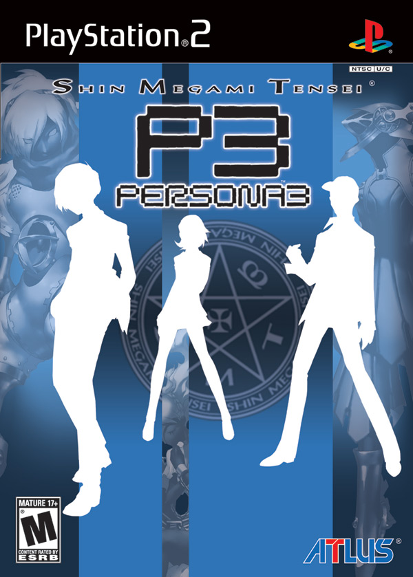


 Infernal Monkey
 map car man words telling me to do things
  Grilled Carrots
  RacinReaver
  Grawl
Grawl 
 wvlfpvp
  Misogynyst Gynecologist