
 85242 85242 |
 35212 35212 |
|
|
||
|
|
|||||||
| Welcome to the Exploding Garrmondo Weiner Interactive Swiss Army Penis. |
|
GFF is a community of gaming and music enthusiasts. We have a team of dedicated moderators, constant member-organized activities, and plenty of custom features, including our unique journal system. If this is your first visit, be sure to check out the FAQ or our GFWiki. You will have to register before you can post. Membership is completely free (and gets rid of the pesky advertisement unit underneath this message).
|
 |
|
|
Thread Tools |
Member 929 Level 33.83 Mar 2006 
|
|
Member 2213 Level 15.98 Mar 2006
|
i love your style (especially digital paintings) but at times i feel like the characters limbs are just a little stiff jointed or the poses aren't exactly right. just work on that (i admit, it is the hardest part of art), and it'll be perfect!! i really want to see your style of painting too (watercolours blah D:< needs more acrylics!!! blends nicer and looks cooler, and is a little easier to handle)
This thing is sticky, and I don't like it. I don't appreciate it. |
Member 789 Level 28.86 Mar 2006
|
Two new sketches. Very sketchy sketches that need work. Planning on using them in a piece when I get time though.
Spoiler:
Spoiler:
I am a dolphin, do you want me on your body?  |
Member 929 Level 33.83 Mar 2006
|
I like the top one. Your anatomy has improved, though I think they still need work, especially on foreshortening/perspective/diff. views/or something.
I was speaking idiomatically. |
Member 469 Level 30.22 Mar 2006
|
you've got some nice sketches.
The top one looks like yuna. The bottom one I like better because of the facial expression. What kind of toxic man-thing is happening now? 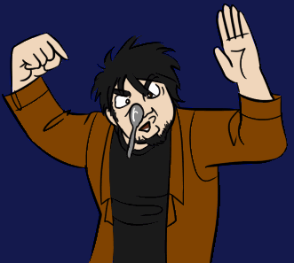 New Record! |
Member 12333 Level 7.40 Sep 2006
|
I'm a visual person, so I like redraws to help me with anatomy. If you don't like it, don't click; http://img.photobucket.com/albums/v5...0s/anatomy.jpg 1. It might be 'style', but distance from neck on both sides = width of head. 2. Your bodies are usually really long but I'll chuck it out to style for now. 3. Your elbow ends at hipbone/end of ribcage. Keep it up. Too lazy to do anymore. FELIPE NO |
Member 789 Level 28.86 Mar 2006
|
 river of souls 30% Code:
Media: Digital
Program: Adobe Photoshop CS2-> Adobe Photoshop CS3 BETA
Dimensions: 2000x3000; 600 pixels/inch
YIELD 65% Code:
Media: Pencil (0.5mm) -> Pen (Sakura Micron 0.01mm) -> Digital Program: Adobe Photoshop CS2 Dimensions: 2000x3527; 600 pixels/inch What, you don't want my bikini-clad body? |
Member 929 Level 33.83 Mar 2006
|
Shit son, you're getting good at this drawing business!
(and they look anatomically correct, to boot!) Jam it back in, in the dark. |
Member 789 Level 28.86 Mar 2006
|
 Its pencil. Whole thing done today on the back of a thematic essay assignment sheet. Don't have pens to ink, so I just had to take a picture. My scanner sucks. There's nowhere I can't reach. |
Member 56 Level 24.48 Mar 2006
|
I really like that "Yield 65%" thing; she has a great body, but the arm just looks wrong. The upper arm tapers too much, the forearm looks like it has been whittled down, and the hand seems far too big. I like the overall style though, with the hair covering the face.
This thing is sticky, and I don't like it. I don't appreciate it.  |
Member 789 Level 28.86 Mar 2006
|
 -> ->  -> ->  -> ->  -> ->  -> ->  Latest advents of this piece. This is just a version for my portfolio, due frighteningly soon. Once all of that is out of the way I'm going to go back, equalize the lines and add more detail. Also looks like I upped the resolution. Happy loading, guys. Additional Spam:  -> ->  -> ->  Portfolio version done. I'll pick it up and work on it in a week or so when my college shit will hopefully be done. The inspiration from this piece was CGsociety with all the fine details and stuff, so hopefully thats what this will evolve into. Take me down to the river of soules... river of soules -portfolio ver.- 100% Code:
Media: Digital
Program: Adobe Photoshop CS2-> Adobe Photoshop CS3 BETA
Dimensions: 2000x3000; 600 pixels/inch
I am a dolphin, do you want me on your body?
Last edited by UltimaIchijouji; Jan 12, 2007 at 09:57 PM.
Reason: This member got a little too post happy.
|
Member 12333 Level 7.40 Sep 2006
|
I don't like the fact that the River of Souls piece has diff tones in the background yet she's flat. Lighting is all messed up too. But I guess you're rushed. Anyhoo moving on, I like the composition on the one taken with a camera.
I was speaking idiomatically. |
Member 789 Level 28.86 Mar 2006
|
Anyway, the other 'cornerstone' piece is done.  If I have time, I'll try to "fix" the circles, even though I like them as is. The last two rows are larger, but when reduced to the size of the others, the symmetry is still off and it doesn't look good (I lost the brush size :\/) Yield. 100% Code:
Media: Pencil (0.5mm) -> Pen (Sakura Micron 0.01mm) -> Digital
Program: Adobe Photoshop CS2 -> Adobe Photoshop CS3 Beta
Dimensions: 2000x3527; 600 pixels/inch
What kind of toxic man-thing is happening now? |
Member 12333 Level 7.40 Sep 2006
|
The coloring is better here, although I'm still annoyed at her crotch. It's like she's flat there or something. Don't blame it on tight pants cause those would only accentuate the line from thight to crotch to thigh.
Greater contrast in skin tone and more tones overall would've been nice. And uh... you could always just copy and paste the circles..... FELIPE NO |
Member 789 Level 28.86 Mar 2006
|
Took a Wii break. I'll fix those things more towards 6am-ish because there are some things bothering me too.
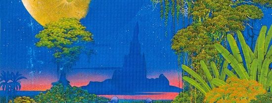
Here, have an advertisement (Portfolio piece #3)  edit//Take a stroll through The Jungle. (Portfolio piece #4)  What, you don't want my bikini-clad body?
Last edited by UltimaIchijouji; Jan 13, 2007 at 03:36 AM.
|
Member 929 Level 33.83 Mar 2006
|
Don't rush your art, it makes it look bad.
 Jam it back in, in the dark. |
Member 789 Level 28.86 Mar 2006
|
There's nowhere I can't reach. |
Member 789 Level 28.86 Mar 2006
|
 Had a chance to work on it before I sent it out to Carnegie-Mellon. I have 3 hours to work before I have to send it out to Drexel, although I don't know if the big post office is open today... The new piece kind of rings more incomplete to me than the old piece did, but it does look better. I need to add more lighting/shading to Krue and blend the mountains better, and it will look much more complete. As soon as CS3 finishes reinstalling, this will happen. After almost 22 hours straight of drawing, I did get some sleep last night. A decent amount too. But it begins once again.... Additional Spam:  Got bored. Look forward to more. This thing is sticky, and I don't like it. I don't appreciate it.
Last edited by UltimaIchijouji; Jan 14, 2007 at 05:55 PM.
Reason: This member got a little too post happy.
|
Member 759 Level 32.36 Mar 2006
|
Enjoy the bump, Ult. I like your coloring. Its very straight foward and bold.
I am a dolphin, do you want me on your body? |
Member 789 Level 28.86 Mar 2006
|
Time for a treat. A special concoction I started after the last one thats coming out well. Might go into the last three portfolios.
 WAR OF OUR WORLDS 30% Code:
Media: Pencil (0.5mm) -> Digital Program: Adobe Photoshop CS3 Beta Dimensions: 3720x5076; 600 pixels/inch I was speaking idiomatically.
Last edited by UltimaIchijouji; Jan 15, 2007 at 12:40 AM.
|
Member 929 Level 33.83 Mar 2006
|
Last image is too much for my dialup
http://img100.imageshack.us/img100/7...rificesrn8.jpg <- her knees look like the back of her knees. What kind of toxic man-thing is happening now? |
Member 12333 Level 7.40 Sep 2006
|
I know you have lots and lots of references and art books. Whatever you have on your computer, anything that you really admire (that has a person in it) open it up in photoshop or whatever. Now use the dropper tool.
Click main skin tone, and hold on to that color. Open another window if you want and brush it on. Then click on shadow tone. Compare shadow with the main skin tone. Now take a look at your painting*, and compare your two contrasting tones. Tell me what you've learned. *It's too late for portfolio sakes, but I was talkin bout river of souls. This is for self improvement. FELIPE NO |
Member 789 Level 28.86 Mar 2006
|
Anyway I didn't do what you recommended because you know how I love to rebel. I understand where you're coming from and I'll probably reference some stuff to get the lighting perfect, but I want to figure out how to find colors and midtones between two colors etc etc. I'm bad at that.  Save #20, some dude from ConceptArt told me all the stuff that was wrong, starting to work on it. Blah blah work on it more soon. I want to work on my other piece too. Juggling time between this and regents and games is so hard. edit//also I flipped it and her face looks kind of weird. I don't really want to mess with lineart anymore but it seems I have no choice anymore. How ya doing, buddy? |
Member 12333 Level 7.40 Sep 2006
|
It's not to copy the tones from the picture. Its to give yourself a smack and realize the large difference.
It's also to show you the different tones on the color wheel. A little purple? Maybe blue. Green? And stop playing those damn games. Your brain is already rotting, you don't need to speed up the process. Jam it back in, in the dark. |
Member 789 Level 28.86 Mar 2006
|
If I work on it today, I'll try what you said then. Nothing better to do. There's nowhere I can't reach.
Last edited by UltimaIchijouji; Jan 21, 2007 at 03:52 PM.
|


 Vemp
Vemp 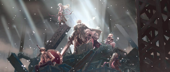
 ComradeTande

 THIEF
THIEF